Friday, September 3, 2010

First impressions

So last September we purchased a house. It's a small little thing, especially compared to the kinds of houses you can get in Texas for 1/3rd of what you would pay anywhere else in the country. But we liked the look of the house...it's very New England-ish. And has 3 park/garden areas in the community, perfect for walking or taking the kids to play (not that I do either of those).

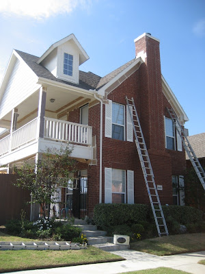
Anyways, the lady we bought it from kept it really nice, but pretty much builder beige. Even from the outside.

This is what the house looked like when we got it

The Hubs and I both felt the white was cheapening the house, so we decided to spruce it up. Painting the brick would have been a maintenance nightmare, since it would essentially require repainting every year or so. So we decided to paint the shutters, rails, and siding. We wanted to go dark on the shutters and rails, and stay light on the siding. No wacky colors like blue or green, just something in the family of Brown or Black for the shutters/rails, and Beige for the siding.


We hired professionals to do the job, since I had no intention of breaking any bones while falling off one of those 20 feet ladders!

Choosing the paint was a mind numbing process. Who knew there could be so many shades of Browns, Blacks, and Beiges! And it's really hard to tell what a 2 x 4 inch paint swatch will look like on a 18 x 36 feet house (I'm guesstimating the numbers :-p ). Word of advice, buy samples and paint large patches on the garage door (ours is behind the house), and make sure to compare both when it's bright and shady against your brick.

Here's what it ended up looking like:


What do you think? The curb appeal is a work in progress...green thumb I have not :-/

Now I'm itching to do our front door!


To decorate the entrance, I got this wrought iron bistro set off of Craigslist, for $75!


Mom thought I was crazy, but I painted it Turquoise and Orange


Like it or Hate it?

This is what it looks like from the entrance

Yes, those are Ikea lanterns, also painted
And this is our pet peacock ;)

Saturday, August 28, 2010

Today is the day...

...that I finally take the plunge.

I'm surprised a post hasn't written itself already, since all I seem to do these days is "dream post"...yes, I imagine all sorts of posts I can or should put up, but it's the first one that is the most daunting. And that's why it's been a month since I created the blog, but am only now getting around to making my first entry.

At least I can now say "Welcome to the 21st century Sama", you now own a blog!

Why "The Design Itch"? Because it really is just that...we got married 2.5 years ago, and all our furnishings were bought after that, but I'm already getting antsy to change it up. Every time I'm in the decorating isles of Target or Ikea, I start drooling like a dog. Heck, I make trips to furniture and home decor stores when I don't even need anything, just to scope out their newest inventory. And I can't help but wish that I had a dozen rooms in our house, at least, so I could decorate each a different way...modern, rustic, glam, country...why settle for just one style if you can have it all?

So, since I don't have a dozen rooms at my leisure, and our pocket book (or the Hubs) certainly doesn't allow for an all new look every few months, I will channel my zeal through this blog...maybe one of you fortunate readers (hah, right, wishful thinking Sama) can benefit from it :)

2 things I promise:
  • no posts without pictures
  • affordable design
Here's to keeping promises...it's hard to have favorites when there are so many to choose from, but here are some that have been ingrained in my mind for a while...


Eclectic dining room a la David Bromstad. The picture doesn't do it justice, this is a must watch episode


Living room by Candice Olson. I was inspired by this to redo our living room fireplace


Another Candice Olson Living/Dining space. I LOVE the pop of Fuchsia amongst the turquoise and blues
Oh what I would do to have a bathroom like that *sigh* From House Beautiful

And my latest favorite designer, Sarah Richardson, who renovated a farmhouse and created this kitchen:


Yes, yes, I realize I watch too much HGTV. Next time I'll show you my house. Until then!